Thursday 31 March 2011

Location Ideas 2

So, after our tutorial with Jon, a new inspiration of using a modern, working factory as our location has become apparent...here are some visual examples of what I am thinking...


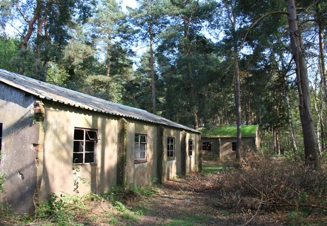
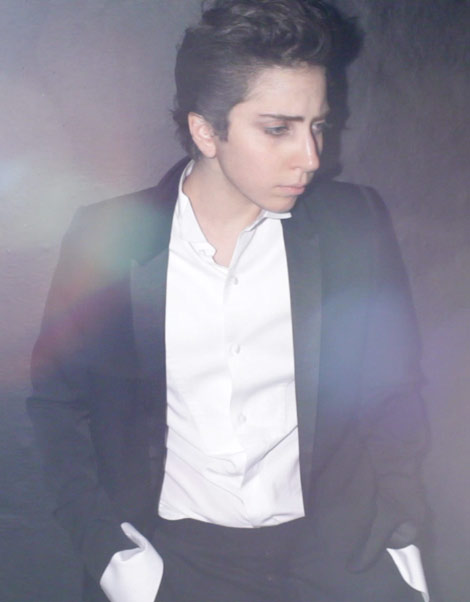
These cylindrical canisters offer a streamlined look which could complement a structured, constructed outfit. The metal surfaces are also good for catching the light, giving a polished aesthetic. I could imagine this as a background, slightly blurred by a short depth of field, with a model stood in the foreground, wearing a blazer and wet look leggings, or something similar.


This image above demonstrates to me the mundanity of the everyday and the idea of a conveyor belt process of this gentleman's job. Again, the metal surfaces reflect the light well and give the whole image a feel of modernity.


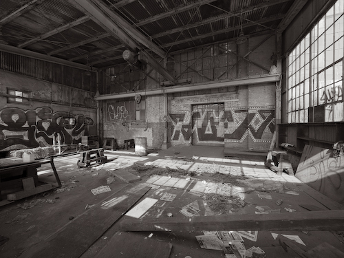
Below, the two different levels/floors within this image could be interesting to shoot. With the model photographed on the highest level and maybe even manipulated so she was standing on the ground floor too could be interesting if the post production was done well enough. The linear effect of the ceiling/roof and the strip roof lights would all emphasise the structured lines within the slothing and styling being worn by the model also.


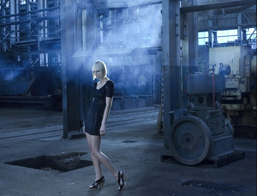
This image is showing a traditional, non-working factory, however, Stephanie has found this image and I feel it shows exactly the look that I envisgae for this project. The model standing in the foreground, posed, with an edgy, futuristic haircut - blonde also stands out from the background, with natural lighting coming in from high windows and almost like a mist forming which is the dust in the air cacthing the light. The blue tone also adds a cold, negative feel to the image implaying that the model is fed up, depressed with her situation to the viewer, which is what we want to portray in our latter images of the spectrum. I would love to replicate something like this but in a modern factory!!

Tutorial

Okay, so I booked a tutorial for us to speak to Jon Purcell about our concept, Myself and Stephanie were able to make this, Fay has given her apologies as she is not well. Basically this tutorial was to run the ideas past Jon and see what his thoughts were, to see if were are on the right lines and that we have developed our ideas enough.

He has given us some helpful and constructive feedback in which we have taken away and will work from.

Some of the points taken:

  • the use of an abandoned factory/building may give a different message to the viewer than that intended, i.e. abandoned is linked with nostalgia and history whereas we are looking at the modern pressures and structure within daily contemporary life on an adult and how the pressure may be greater in the present day than it was say three/four decades ago...
  • the use of a modern factory - clinical, streamlined, lots of metal, stainless steel surfaces, minimalist structure, white space - all emphasises the modern, robotic and polished styling aesthetic that the stylists are thinking of pursuing.
  • the spectrum of starting off with a youthful, child like, relaxed and carefree aesthetic to moving into a restricted, confined, robotic being, fixed by 9-5 work days and structure -over the 8 images/editorial pages - needs to be succinct and endlessly planned to create a seamless succession. This is a major priority and challenge within the image making - the styling and lighting need to be planned extremely well to make the images blend but also stand out from one another successfully. An idea that Stephanie has had is to start off with the model wearing minimal clothing (not nude!) but limited fabric/covering and then each image after this another garment/layer/material is added, this repeated over the images towards the end will represent a person being constructed, growing up, building their outer shell, becoming adults, almost like a robotic armour being built....I love this idea and feel it would help the spectrum to be shown much more effectively within the images.
We also need a group meeting as soon as possible! To bring all of our ideas together and discuss them as I feel we all may have slightly different variations on what we are thinking the end result will look like, the styling, the make-up and hair (and who will be doing this), locations etc... so I ahve booked a Study Pod in the library fro next Monday (4th April) to try to get all this sorted. We will hopefully leave afterwards with clear directions of what is going to happen, when and where...

Tuesday 29 March 2011

Current thoughts

Fay, Stephanie and myself have discussed our ideas and location possibilities and feel it would be succesful to go with the idea of using a working factory or unused building which is local (to Preston), safe to work in and where we are able to gain permission by contacting the necessary people in time to organise test shoots and the actual shoot in time for this project submission.

So, we are in the process of finding locations suitable to these requirements...an update soon!

location inspiration


Here is some imagery which could help to inspire us further on the ideas that we have already thought about:

As I have mentioned below, this is probably not the sort of location that we will be choosing to go for and may well be much suited to a different project in the future, as I love the idea of these images in black and white. I am just not sure if I would want to venture around this setting alone...!

(Below) This is an image of a derelict car from WWII, which is currently in the metal shelters within the adjacent forest to the airfield. I love the aesthetic of crumbling machinery, as I think the beauty of time wearing the old technology away is interesting. A sense of photographing it is almost to preserve its existence, but the physical nature of our world will continue to wear this car away. In terms of the aesthetic we want in our photoshoot, this does not really match, as we have discussed as a group we want to go for a more polished, minimal look to give a strong comparison to our last fashion photography submission and this contrast will also add variety to our personal portfolios. Its just this theme correlates with the idea of abandoned buildings and the military forces deriving from the word 'Education'.

(Below) This is a derelict control tower on the airfield, as you can see the boarded up windows make the building look quite ugly but with the lighting right and taken with the building in the distance with the model in the foreground the image could look very eerie and effective. However, if the model was too close to the building and the background was too close, the structure would just look like an old brick wall in the background which would not be as nearly as effective.

The idea of using an RAF base could be interesting as obviously the 'Forces' or Military stands for education and discipline is a big part of life for those who work within Army, RAF, Navy, etc.


Another idea I have had is using old, abandoned military buildings. For example, only a couple of miles from where I live in Shropshire, there is an old RAF Airfield which was used during WWII and some of the original bunkers still remain (above) as well as metal buildings and sheds with abandoned equipment. This below is a map of where the airfield in located. Granted, if we chose this as a location for our shoot, this would mean getting the group members down to Shropshire as well as a model and a location lighting kit or two, as well as props if we are to use any, plus the outfits and the rest of the styling kit, and also dependant on the weather (which is often touch and go)... which could be interesting!


This setting is very cliched and has been done too many times before to allow for our project to be original, but it can be used as a starting point to be explored upon.

This is an interior image of the mental asylum, Whittingham Hospital, located on the outskirts of Preston, found on the internet by Stephanie. The mental asylum was opened in 1869 and only closed recently in 1995. The errie aesthetic is exagerrated by the holes in the floorboards, the peeling paint, holes in the ceiling and greenery growing from the building's exterior and into the rooms. The long corridors remind the veiwer of the building's purpose and such an idea could be used to give both visual and conceptual perspective, while photographing a model in the foreground.

This is the front entrance to one of the buildings at the asylum site. The location included a railway station in its first few decades of use, as well as a post office and convenience shops. One can imagine the grandeur of this building when it was first opened and unfortunately the metal fencing around the exterior leaves the site truly abandoned until it is developed or knocked down in the future...

location ideas

Thinking about the robotics idea, myself, Fay and Stephanie have discussed before our PH2011 Lecture yesterday (28th March) about some possible locations which we feel could be succcesful:

  1. A working factory - with or without workers/labourers in the background of the photographs. This location would emphasise the idea of education being a working process, the child is entered as a material and leaves the factory as an end product, with examination results or qualifications or the mundanity of everyday - doing your course work, chipping away at the time left in the educational institution.I would love the idea of photographing a model in the foreground of an image with usual workers and goings on in the background, with the model well lit and the light disappering into the background, a shallow depth of field making the model stand out from the background a little more than usual.
  2. An abandoned building - having the model positioned in a worn-out, tumbling building. However, this is very cliched! and reminds me of Tim Walker, a bit overdone! some locations that Steephanie has found around Preston are an ex mental asylum which when it was open was the laargest in the country. the images that other people have taken whilst visting the building in its current state are very eerie and quite disturbing. The idea of using a menatl asylum would link to the focus word of Education and our idea of robotics, in the sense of constrainment, the idea of wearing a straight jacket, being 'put away' for your mental instabilities...all quite sshivering thoughts really! Obviously, the realistic idea of using an abandoned building is probably unlikely, due to the health and safety and gaining permission for access.
  3. An old factory - Stephanie also sourced on the internet an ex-working mill just outside Preston. Penwortham Mill looks like it could be very useful as it still has the equipment inside, I can imagine a model draped on a conveyor belt or something similar. This would imply the idea of us all being placed into the education system as if it is a factory, we are of a similar age and 'packaged' into classes and often are in the same classes until our last year at the particular school.
  4. A police station - One in Preston which closed in 2006 has been used by a university student in the past with permission for entry. The building has metal railings and interior metal gates, police cells, barred windows and interview rooms. The idea of policing and the law could be a reflection on the lack of education in some people's lives or indeed the ignorance of education and the effect that this has on crime and anti-social behaviour, current trends, class room behaviour..?

More Nick Knight - SHOWStudio


(Above) I have chosen to show this image as although the lack of styling or detail is not attractive to the sort of work we are nwanting to achieve, I believe the style of lighting is very effective. I would like to work with this abstract lighting, posssible not as contrasted as above, but a toned down version, allowing more lighting to ctach the details of the clothing, styling and location. I feel the strong lighting here accentuates the idea of robotics and mechanism and could also be argued to show 'tunneled vision', which some people may be forced into during their education. For example, tunneled throigh their revsion for examinations or focused on an end goal, their submissions, attainment, final grades, etc.

A little description from SHOWStudio:

"25 June [2010] saw the latest collaboration between master stylist Nicola Formichetti and Nick Knight to shoot their latest men’s fashion editorial for Vogue Hommes Japan under the working title ‘Elegant Mechanics’...showcasing grease, grit and gentlemanly attire from the likes of Armani, Prada and Givenchy by Riccardo Tisci."

Source: http://showstudio.com/project/livestudio/session/elegant_mechanics

"...shooting a selection of A/W 2010 menswear...The studio is strewn with motorcycle parts to set the scene, while the clothes themselves are a mix of battered vintage biker leathers, and refined formal tailoring..."

Source: http://showstudio.com/blog/45732


These images are from the same shoot featured in Vogue Homme Japan. The model is actually Lady Gaga musing as 'Jo Calderone'. I have not chosen to show these images because I think they are attractive, because i do not think they are, they are not to my personal taste anyway. However, they show the use of a female model taking on the role of a male, which is accentuated by the use of adrogynous styling. This look is very popular, or was around 6 months ago in the A/W clothing season, adrogynous looks appeared to be very current then. I am questioning whether we should use a female within our own imagery or go for a male. I think using a male will be different, both for the experience of working with them as models and also for our portfolios, as in the past I have personally just worked with female models. Maybe we could add a different dimension/look to our concept by using a male?


Saturday 26 March 2011

Nick Knight

When you think of robotics, you would usually think of mechanisms, structure, contraining something, angualr and stop/start movement as well as the idea of things being futuristic. I have chosen this image above as the pose and lighting is what epitomises 'robotics' to me. I do not particularly like the digital art which has been applied to the model even though this has achieved the sci-fi, generated computer gaming aesthetic that the creators were presumably intending. I believe we could take inspiration from the pose direction and lighting from this, especially if we were to work in a studio environment.


From a styling point of view, I saw this image and felt it would fit with the 'robotics' idea that we are currently going with. I feel the minimal materials/pieces of clothing is more effective than placing a whole matched outfit on the model. The minimal look is more suited to the robotics idea I think, however as the stylists, fay and Sophie will be covering this area, as myself and Stephanie will be sorting the photographic aspects.


I love this image - the use of lines and folds within the garments, hair and make-up are effective as well as the muted, metallic tones which are used. I believe this look portrays robotics and slight futurism well and could be used as inspiration? The age of the model is similar to the age of model we will be using, hopefully tall, probably similar age to ourselves, early 20's.


Nick Knight photographed the original image for this and it has been digitally enhanced by the rest of the creative team working with the music band, Massive Attack. I love the effect of shattering glass/ice, the fragments signify an explosion and this in the context of our robotics idea could be seen as an expolsion of imagination as a child, or as an explosion of anger, boredom, mundanity and limits of an adult. As part of our imagery, we could achieve something similar to this in our post-production work while still keeping the polished aesthetic we are wanting to achieve. The limited colour pallette and muted blue,grey and silver tones suggest sophistication and calmness in contrast to the explosive emotion.


I have chosen this image to show the simplicity of how just pieces of paper can change an image so much. The paper reminds me of shards of glass which are portrayed to be cutting into the skin. This could signify the pressure to do well in life through our education, the pressure we put ourselves under or someone else does, for example our jobs, our courses, time pressures. It is an interesting idea to possibly show the emotions that we are trying to express in the images physically, through materials and styling instead of just impluing hese through the pose or facial gesture of the model.


These two images are from a series photographed by Knight, showing disabled people in 'fashion situations'. The skirt worn by the mnodel is what attracted me to the images, as its linear form reminds of robotics and futurism. The pale gold tones along with cream touches, natural make-up and hair and soft lighting all contribute to natural but sophisticated photographs which is an attractive aesthetic to me personally.

GARETH PUGH PITTI 2011 - FILM BY RUTH HOGBEN from SHOWstudio on Vimeo.


This video is from Nick knights SHOWstudio website and showcases designer Gareth Pugh's first collection shown at Pitti Immagine (a bi-annual fashion show in Florence, Italy, that I personally visit) in January 2011.
I have added this to the post as I feel the aesthetic of the fragmented lighting and monochrome, structured clothing relates to the idea of robotics and mechanisms.

Gareth Pugh Pitti Immagine #79 2011

"With a collection inspired by religious iconography and Florentine opulence, Gareth Pugh made his Italian fashion debut at Pitti Immagine #79. Showcasing his clothes via a unique fashion film, created with Ruth Hogben and projected onto the ceiling of a 14th-century church, Pugh melded the grand traditions and art of this ancient city with his own hyper-modern fashion vision." Source: http://showstudio.com/project/gareth_pugh_pitti_immagine_79_2011#film

Initial robotic imagery

These images have been found in a “Super Models” editorial in Tush Magazine, recently on sale.

"Instead of featuring the creations of top designers on models, Tush magazine thought out-of-the-box and decided to showcase them on robots! ... Each ‘super model’ even has their very own name; Alec wears Yves Saint Laurent, Milla in Donna Karan, Luca in Giorgio Armani, Nadja in Chanel, and Devon in vintage Paris Mon Amour. This ultramodern and attention-grabbing editorial was skillfully shot by photographer Philip Karlberg with Friederike M. helping in the design."
Source: http://www.nava-k.com/2010/03/robot-fashion.html


The use of complementary backgrounds to the accesories/mechanical parts used to construct the robots is effective and attractive. The photographs are well lit and suit the style of shoot well.


"“Robots to rule the world of fashion,” was one of the topics at the Wired magazine London office just few short weeks ago. No, the robots will never replace the gorgeous models, or fashion shoots. They do something different – they help you try the clothes in the virtual worlds." source: http://estoniabritishcouncil.wordpress.com/2010/11/12/robots-to-rule-the-world-of-fashion/
This look is very futuristic which is not the way we are likely to take the robotic/mechanical idea, but the use of silver and metallics is interesting against a matte, colour block background.


This is a double page spread from "Geeky/Tech" Editorial, Fake Magazine, Autumn 2010. The use of tape or light reflecting material has a robotic aesthetic to it. However the make-up looks too exagerated/bold/scary for the style we will be going for!


These lighting strobes could be seen as implying laser cutting/prising yourself out of the education system...a bit sci -fi...but would be great to re-create something like this!

Looking to the future to express how fashion changes throughout history, Hussein Chalayan created six mechanical dresses that would transform from one era to another, using embedded technology and smart wires, for his runway show at the Paris Fashion Week. The robotic dresses, which took six months to create with the help of the film special effects wizards of 2D3D, are not part of his new collection, but Hussein expressed that he wanted to collaborate with a technology company to make such transformations a reality.


Group meeting

Yesterday, Friday 25th March, Fay, Stephanie and myself met up to discuss the ideas that we had thought about since the last seminar and our initial conversations.

These are the notes that I took:

  • the idea of robotics - movement, generated/breaking free from the grind and the stereotypical education system.
  • letters of EDUCATION - for example, photographing E for Exams, D for Detention, U for Uniform, etc.
  • amongst some others that we briefly discussed and mainly dismissed as a group
Both of the above ideas came from Fay and they can be seen on her blog.

The idea of robotics (which we are thinking of taking forward) is depicting the typical student who is sent through education, standardised from their starting year until the final year, almost put through a running machine, the treadmill of projects, exams, grades, reports, holidays and then the next year, the process starts all over again... we could take a dimension of this and show a person trying to break free from the process, or the idea that as people get older they lose their creativity, or the construction of educaation as a whole, the school day, the school term/university semesters, brief - project - submission - feedback - grades - brief - project...and so on.

These dimensions of the robotic idea have come from the video below, "Changing Education Paradigms" and persona experiences of education. From this Fay has found a contemporary shoot in Dazed and Confused, photographed by Mark Pillai - all of this is on Fay's blog. The styling is very constructed but also quite minimalist and block colours, in skin tight materials as well as transparent plastics and polished metals. In terms of photography, it has a similar style to Nick Knight's work, the images are shot in the studio, using both white and black backgrounds alternatively, with strong lighting and polished post production work.

Another idea for this theme (thinking about the submission of 8 images/editorial pages) is to have a 'spectrum effect' e.g. starting off with colours/explosion/lots of creativity (young child)/no inhibitions, shown by lots of layers, then moving to teenage years where there is still creativity but not as much, peer pressure/trying to be different and stand out from the crowd but in the structured education system and moving to and finishing with the modern adult in a structured job, 9am-5pm, possibly after a degree or finishing their path of education, lack of creativity, run of the mill, the treadmill of daily life, maybe commuting/'the rat race', may be bored with their job position or current life position which could be portrayed with a dull, flat aesthetic...just all ideas.

I am going to find some inspiration from this idea and look at contemporary fashoin photographers who have depicted this sort of idea or aesthetic.

Tuesday 22 March 2011

inspirational quote...

In one of our weekly seminars fro PH2011, we were given two essays to read from "The Child in the City" by Colin Ward.

"The aim of education is to help people learn how to understand, control and ultimately, change their environment. But the education system... is geared to precisely the opposite end: i.e. pupils are taught that the world is extremely difficult to understand; that only a privileged few can reach such an understanding; that these few have the right to control the activities of all the rest; and that, far from trying to change their environment, the vast majority of people should try and fit happily with the situation as it is." Albert Hunt, Chapter 16, The City as a Resource.

It could be said that people are taught the same things at the same age so they are on a levelling basis, exams taken at the same time are then to unpick this levelling and see those who are brighter than others... the education system is supposed to be fair... in a inverse way. Would we be able to show this cycle someway, using photography? An interesting concept to think about...

Sunday 13 March 2011

"An Education" Official Trailer!


I recognise this title is very literal! However... I watched this film recently and really enjoyed it. Carey Mulligan stars as a 16 year old schoolgirl and this film shows her maturing and dating an older man. The styling and props are from the early 1960's... a retro look may be something to think about...?

RSA Animate - Changing Education Paradigms


This is the video that I mentioned in the blog post below about the PH2011 Seminar. I find the illustrations and the way the speaker has constructed his lecture as very interesting and fun to watch and listen to! Highlights some interesting points too...som eof which are included in my bullet pointed list also below...

Saturday 12 March 2011

PH2011 Seminar

The aim of our first seminar since we were given our new brief was to look at initial inspiration and think about the depth involved in creating a strong concept. Having a strong concept is one of the key themes for this brief and module as a whole and as I have already mentioned I personally want to push the boundaries on this project to create some great imagery! I was very pleased with the work we produced for the last assignment and believe we had a strong and original concept. But I believe everyone should aim to do better in all they do...

We were shown a video named "Changing Education Paradigms" which I found inspirational, more in the way the video was made than the information I received, I wish I had found about the person who makes these videos earlier! I am going to post this video on my blog for you to see! (As I am aware, this blog is looking very text heavy!!)

These are some ideas I noted down whilst in the seminar:
  • divergent thinking
  • factory process - education years - same ages, different personalities and abilities
  • do we lose creativity as we grow older...??
  • standardising tests/exams - right answers comparable to life experience...
  • being constrained
  • structured
  • hierarchy - people above and blow yourself - no one is equal/level
  • tuition
  • ADHD
  • private/state/bourding schools
  • behaviour and location of school - some constrained by negative environment and behaviourial/social problems - quality of life emphasised within/by education?
  • teen pregnancy
  • kids playing at breaktime/'recess'
  • packed lunches - school canteen/ cafeteria
  • sports day
  • home schooling - tutoring
  • student protests
  • diverse, different levels/paths
  • pressure to achieve more - depression rates synomymous with academic level? higher up, less happy?
  • bullying
  • harnesses independance
  • generally too much? too many exams? not enough relevance for everyday life? eg. Pythagoras' Theorum - relevance in modern normal life?!
  • moulding, constraints, putting boundaries on natural personality and interests
  • containment
  • Films: High School Musical, Hairspray, Grease, Fame, Harry Potter, Juno, Kes...
  • TV Programmes: Grange Hill, Byker Grove, Skins, The Inbetweeners
  • military and armed forces
  • portrait year photographs
  • proud moments at graduation - hat and gown

Friday 11 March 2011

Group Members!

  1. Stephanie Harbeson
  2. Fay Bruno
  3. Sophie Davies
  4. Myself...
have decided to work together again, like the last project. I think we are all looking forward to what can be achieved in this brief and are looking forward to our final images... I think we are all generally very openminded to what we want to do.

Quick Mind Map

After receiving the brief, I spent 20 minutes just collecting words and thoughts from the internet deriving from the word 'Education'. I will take this as initial inspiration as I could take one or two ideas from this and expand further...

­EDUCATION

activities that impart knowledge or skill

any act or experience that has a formative effect on the mind, character or physical ability of an individual

institution gradual process

The process or art of imparting knowledge, skill and judgment; Facts, skills and ideas that have been learned, either formally or informally

curriculum stems from the Latin word for race course, referring to the course of and experiences through which children grow to become mature adults. ...

distribution

Instruction

shifts

experience

broad

well-balanced and rich

develop the ability to think and write clearly, maintain lifelong patterns of effective living, appreciate aesthetic and creative expressions

Clockwork System

degree Structured

students

balance

rigid

can improve disadvantaged backgrounds

foundation

semester

research

raising fees selective

variety of backgrounds

bursaries and scholarships diversity

Universities argue that they have to charge higher fees to make up for government cuts of £940m over the next academic year.

Thursday 10 March 2011

Next Brief: EDUCATION

Okay, so onto the next brief!

Our starting point is the word EDUCATION...it has been left deliberately open to allow us to develop our creativity and fully explore before finalising a concept and working on it.

We are to produce a set of images to feature in a fashion editorial context, these can be a mix of single shots and double page spreads...with each photo (8 of them in total) being printed as A3 size.

I am looking forward to this project as, like the latter project, we can be as creative as we want...there are no boundaries apart from the one word which it must relate to...but from this word, there is so much which can be explored!

Personally, I believe the biggest obstacle (but hopefully most fun aspect) in this brief will be creating an original concept relating to EDUCATION...our strongest point of the project should be our concept, as well as the technical photography and the styling of course, but I think considerable time needs to be spent on thinking, exploring, researching and dissecting inspiration and using this to our advantage to create something which is different and will be enjoyable to work on right up until the deadline!

Deadline: Thursday 5th May...9 weeks and counting!