
These polka dots are part of the fabric which is draped over the model's head, but we could take inspiration from this and place dots either in the background or foreground of images...to take inspiration from something is not to copy it directly but take a small part of it and personally adapt it. I think a polka dot repeated pattern could add a fun element to our images!
 Similar to the polka dot idea above, these diamonds are part of the clothing that the model is wearing, however the geometric shape of the diamond could influence a backround or foreground layer of our photographs...? or diamond cut out sections of the face, or shoulders?
The opportunities are endless!!

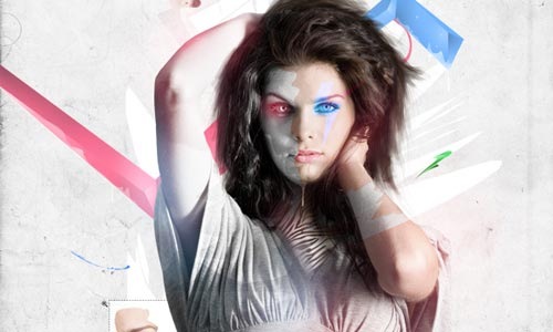
This image is from Paper Mode - an online fashion directory that Steph has found while I was making this post! I love the cut out aesthetic shown abone. The style and colours are very futuristic and I think if we applied this look in the right way in our images it could look very succesful! A set of images could easily be made too, as different sections of the face or shoulders, eyes or make-up could be cut away and highlighted on each photograph within the set...
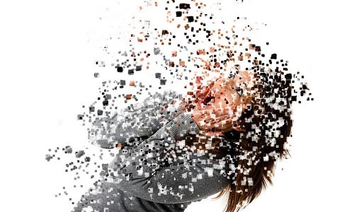
I love this cutting effect that the above image has, almost like the model is being re-formatted in a technical way, symbolising that a model's look can easily be changed or even symbolising that fashion is constantly changing, a cycle effect, everything is always changing...? could be interesting to take this idea further!
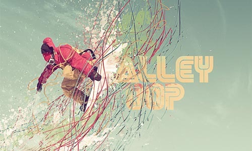
I chose to display this image above, as I like the coloured strands/lines that are placed around the subject. We could experiment with such lines coming from the model's face, or even extending lines of make-up from their faces and into the background?
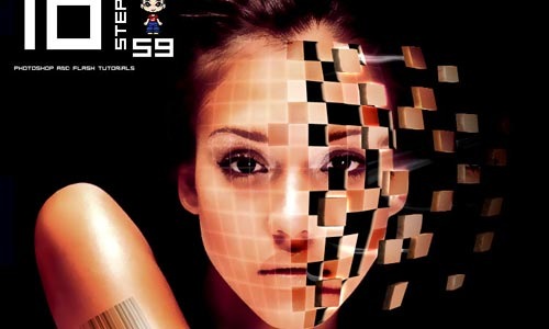
Growing trend appearing of me selecting images with cut-away geometric shapes! Maybe it's a sign to work in this way?! It looks fun and futuristic! Definately worth considering.

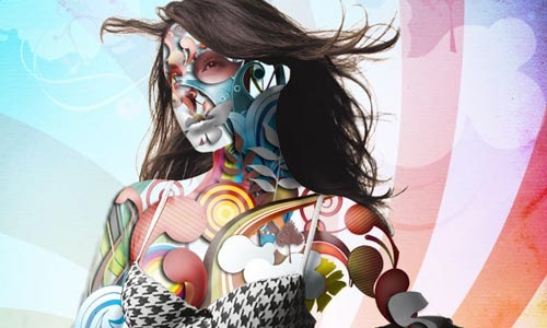
This image above is a bit sketchy for the look that I think we should go for, however I like the various layers that are visible. There are layers of paint, plus thin white circles in the foreground too as well as the main subject. I think it makes for an interesting composition. I would like to experiment in our images to see if the addition of lots of layers is effective or whether a minimalist approach is more effective...
This monchrome image above makes for a very effective photograph! I like it as the checkerboard pattern (bottom right) reminds me of Victor Vasarely's Optical Art from the 1960's and 1970's. Whereas, the minimalist geometriuc shapes in plain white are eye-catching and just add a simple futuristic touch the image. I don't think we would change our images to monochrome or even have the models the same colours/tones as the background though, as the focal issue of our images is the historical and futuristic contrast through the vehicles of make-up and hair therefore we want these to stand out from the background - not blend in.
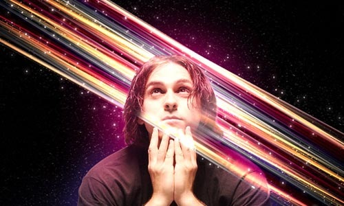
I'm not keen on the above style, I think the 'fantasy' look with the night stars looks a bit cheap and unimaginative however I chose the image for its use of coloured stripes across the subject, maybe we could take influence from this?
I like the use of lines in the image above. Also, the opacity is lowered in some of the sections giving parts of the image a translucent look, we could experiment with this in someway in our photographs...
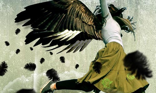
The inclusion of black feathers into the post production could be a good idea... Kasia's false eyelashes have feathers at the sides so we could accentuate this feature throughout the whole photograph of her...?
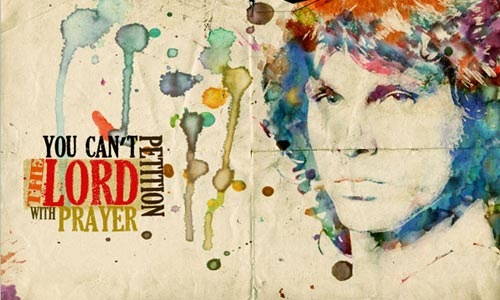
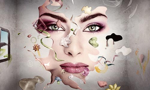
I have chosen this image (above) because I like the use of paint/ink splatter as it adds a more artistic context to the image rather than being wholly technical within the photograph's production. The use of different artictuc layers is effective too, making the photograph into a mixed media piece. I do not think we would make our photographs this 'arty' but the ink splatters could be considered...or maybe it is not 'futuristic' but a bit past/retro/american high - school aesthetic?
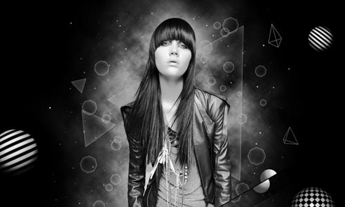
I like the reference to surrealism in the image above.
This aesthetic reminds me of Salvador Dali's art work in which he
painted obscure, unrelated objects into the main subjects of his paintings.
Could be an idea to think about? Like the historical reference, we could take reference from a past artist and represent in a modern/futuristic way... the way in which fashion comes around and changes slightly but remains very similar in some ways...
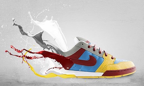
The use of flowing paint above creates movement - the theme usually associated with trainers - very effective! Not neccesrily directly for our set of images but effective and inspirational for future work perhaps?
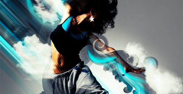

The blue smoke is a bit overpowering at the bottom of the image, however, the use of lines at the top and pattern replacing parts of the body could be an interesting aesthetic...replacing the contemporary model with a futuristic dream of a person?

Placing the models into a futuristic landscapoe coulkd be an idea...
but we need to remember the context of the shoot
- fashion not electronic gaming/fantasy!

(Above) The use of translucnet layers is effective here. We could use areas of transparency and opacity on shapes on the models faces, for example, within our photographs.

(Above) This is very effective! I love how the added material, I think it is meant to be paper..., creates almost a new structure of the body, almost archtiectural. I love the idea of making the body into something else, could the ideology of making a person into something they are not through the use of fashion be anything to do with this I wonder...? Interesting to consider!

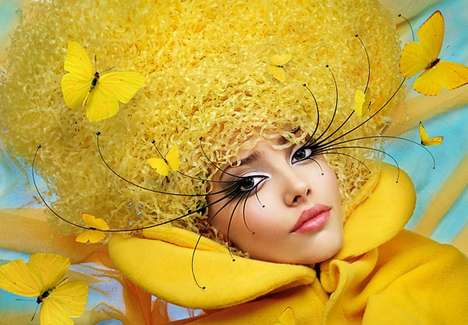
I chose this image for its use of tone within a minimal colour pallete. The vibrancy of the yellow is applied to the whole image in different textures and also applies to the light creamy yellow eye make-up. The extravagant eye-lashes and butterflies also share similarities to the accesories used within our images.
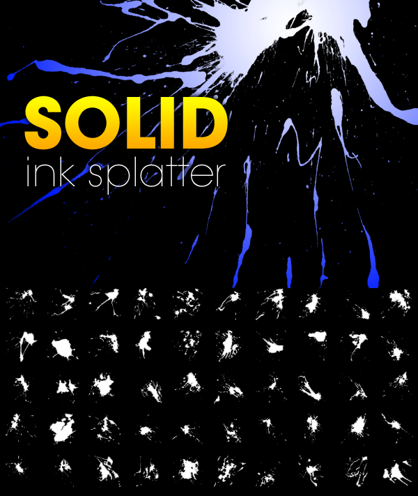
Ink splatters could be good to experiment with...
however it is a bit passe and been done to death!
(Above) I think the use of the light appearing in the centre and
blurring outwards towards the edges of the image is effective and could possibly be applied
to our photographs, however as the models' faces appear in the centre of the photograph, the lighting effect may have to be positioned in one of the top corners of the image instead?

The use of the 3D effect in the image above, the lighting up of certain areas of the shapes and the use of tonal colours makes the text shapely and stand out from the background. We could take inspiration form this and have certain shapes or lines in a similar aesthetic so they stand away from the background like the image above. However, if shapes do stand out then this may detract attention from the model and also risks the model's face, form and skintone looking flat and sullen against the stand-out from the background areas...?!
 I like the use of the tonal lines in the graphic above. I found this image on a graphic design site and thought it could be inspirational in some way... Personally, I like the use of lines and curves within my work as I like minimalist, streamlined patterns so maybe this will be staying too much in my comfort zone if I suggest this to the group? Its worth a mention, but I think I need to step out of the comfort zone and push some boundaries, as patterns and graphics like this have been used so many times that it is boring an unimaginative!
Our photographs need to be eye-catchingly different!

I like how this image above looks futuristic and almost a little scientific, the way the parts of the traditional typewriter are being sprung out or exploding from the machine's outer shell. Maybe we could create some sort of futuristic explosion within our images? Just a thought!
I like the image below, as I think the smoky grey background could be effective in our images. I need to decide whether I think the images need more of a minimalist aesthetic added to them or more of an abstract style. Then at least if I have thought about this I am able to go baack to the group and mention images that I like and style that I think would look effective within our photographs, reasons why and genral thoughts and feedback.
I like the image below, as I think the smoky grey background could be effective in our images. I need to decide whether I think the images need more of a minimalist aesthetic added to them or more of an abstract style. Then at least if I have thought about this I am able to go baack to the group and mention images that I like and style that I think would look effective within our photographs, reasons why and genral thoughts and feedback.
No comments:
Post a Comment