Friday 22 April 2011

The final images!


These are the final images that are going to be printed

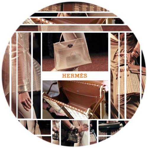
Page numbers have been added to give the images an editorial context as we do not have credits for the clothing and accesories.

The font of thee title has altered since I last posted, this was due to a group decision and was chosen from dafont.com, a great online typeface database!! We feel the font reflects our imagery and the message we want to portray with our editorial.

Overall, I am very pleased with our final outcome and have enjoyed the project. I feel we all communicated better as a group in this project and have enjoyed working with stylists and I have been very impressed with their sourcing and researching of clothing and accesories!! I think they have done very well and should be pleased with what they have achieved. Myself and Stephanie were not too pleased with our images at the shoot and up until we had a bit of time to reflect, select our favourites individually to contribute to the group with these and start editing the chosen images. Due to the post production work, we are both now pleased with what we has been doen to the photographs and how they have all come together to create a succesful body of work.

So, off to the printers!!

We have left enough time to allow for the easter mail/post disruption and bank holidays, so as long as they arrive in excellent quality, all will be good!! :)


Thursday 21 April 2011

Nearing the finish!!

This is a mock up of the edited images that Stephanie has completed! As a group, we are all really pleased with the outcome, the imagery, the layout and the title.

The nearer the end of the editorial, white borders are slightly thicker/wider to make the idea of being constrained the older you get and the loss of a persons creativity with age emphasised throughout.

The stylists did not seem to keen on the idea of having credits for the items of clothing and accesories that they sourced. Myself and Stephannie did not mind this at all, we are happy with or without credits, as the stylists have more experience with making editorials and if they feel the images are best without them then this is totally fine. On the first opening editorial page, the main title features centrally above the image, while the photographers and stylists names are positioned centrally at the bottom of the page as this looks most appropriate.

The options of a font were also discussed as a group to make sure everyone was happy and we all concluded with the font above as we feel it conveys the message we wanted, it seems quite personal, allowing the viewer to connect with the model in the images, knowing about age and the impact of time and the loss of creativity within our lives as we all get older.

The last tweaks of lighting and the final touches such as the addition of nail varnish in the post production stage, changes of colour, less/more make-up...for the best effects and most succesful final outcome have all been discussed since seeing this layout.

The last edits are now being done!!

Wednesday 20 April 2011

Editorial Title

Due to our images taking a different direction to what we were originally thinking at the start of the project i.e. our images not really showing a 'spectrum' of childhood to adult years, but now a losing of creativity and imagination and the onslaught of constructing your life and being structured within the years of when a person is older.

The idea of losing creativity is the main idea of our imagery now, so we have done a little thinking between ourselves and kept feeding back options, ideas, definitions... until we came to a unanimous decision!

Our chosen title: "The Creative Manifestation"

deriving from:
- the flow of creativity
- The Manifestation of Creative Fashion?
- The Manifestation of Losing Creativity?
- the act of demonstrating / a display
- the state of being manifested
- an indication or sign
- a public demonstration of feeling

Current editing stage

Stephanie is experimenting within the editing process and is keeping us well informed of the stage of where she is at with the imagery.

This is a mock-up layout of the chosen images and some of these images are edited:

This is a first mock up of the layout that we may use. The editorial pages appear in 'pairs' to me anyway. Page 1 and 2 have similar lighting and styling, page 3 and 4 will have similar lighting and look once edited, pages 5 and 6 are very similar in lighting and styling and also pages 7 and 8. This pairing has created a continuum look which I think is both interesting and attractive as it is breaking up the routine look of a typical editorial spread.

Comments for this layout:

"We are thinking Outfit 1, the colour tone for that is about right, we just need to fiddle with a few more things - like getting the dress to be a bit more lively, instead of dull.

Outfit 2 & 3 we are thinking of a more goldish tone, rather than blue-purple. As to bring out the gold in the glitter pants and for it to be more colourful - but not over the top. Just keeping it simple!


Outfit 5 & 6 - We think the lighting is really strong in these. I don't think we will be doing much changes to this, just regular editing and a bit of colour correctio
n.

Outfit 7 & 8 - I know these two images aren't as dark as we wanted it to be, but we will try to make them a bit darker. But I think 5 & 6 will still be much darker... so we
may just work with the peachy colour."
Taken from the group email when myself and Stephanie sent this initial mock-up.


2nd Mock -Up:
Close up of the 1st editorial page:
As myself and Stephanie were unsure about the effectiveness and strength of the photography in Outfit 4, we considered removing this image and having the above layout. This would make our first photograph a double page spread instead of a single image. The title has initialy been made as 'tick tock' just to show a title in this place and this will not necessarily be used for the actual editorial as we do not think this title is representing our editorial to its full potential.

3rd Mock-Up:
This has the smae layout as Mock Up 2 but the slight addition of the headdress image for Outfit 4. Fay and Stephanie particularly liked this image as they felt it added something a bit different to the construction fo the editorial in terms of varying the layout and adding something that Fay made especially for the shoot. However, I felt the breaking up of the layout was effective but do not particularly like this image with the model and the positioning of the headdress and its shadows falling on her face. Sophie also agreed that the headdress would need a lot of editing to make it look good along with the other images so we have decided to move on from this idea and use our images that we all feel are stronger.


Initial layout thoughts

As a group we have been looking for inspirational layouts for our editorial pages. Due to our images likely to be seen in a similar magazine editorial to Vogue/Harpers Bazaar, we are thinking a simple white border or full bleed, possibly with a thin black border? on certain images? or all of them?

Also, due to the high fashion, chic, sophisticated and minimal look that the stylists want from this shoot, we think a simple white border around the images would compliment them well rather than anything overtly creative or dynamic as this would not suit the aesthetic that we are wanting.

Here are some ideas that we had:

A simple white border with a thin black line - looks simple, effective, structured, constrained, but minimal and chic.


The very small text caption of ysl.com is neat and understated at the centre of the bootom of the editorial page. This is sophisticated and minimalist, could be an idea for us to centralise our editorial title/captions/credits...?

Even though this image is a Spring/Summer 2011 Giuseppe Zanotti shoes advert, I like how the 'rule of thirds' has been succesfully applied to create an interesting alternative to the usual full bleed advertisement. This varient offers a large image as well as room for the company logo and credits making the page and company look like they deserve to keep white space to show themselves off. I like the idea of using a similar layout for some of our editorial pages as I think it will break up the routine of the layout a bit if we alternate with slight varieties of image placement.


This Hermes advert uses an interesting method of displaying close up images of details of their luxury products. The linear structure and repeated pattern symbolises the patterns of the maxi dress from outfit 1 and the abstract facets of a child's imagination mixed with the linear structure and constrainment of the 9-5 job and a normal adult life balancing work, family, pleasure, etc. An alternative layout to show fabric, patterns or textural close-up shots ...

Below - This is the opening page of a recent editorial within French Vogue. I have chosen to show this as I feel the style of text is effective for the editorial. The streamlined and modern font matches the content to follow and the simple use of black and white could influence the aesthetic that we choose to have ourselves for our editorial pages. I feel simple black and white text could work well with our photographs as they have a mixture of strong and soft lighting and a variety of clothing styles with the only factor staying the same throughout is the model that has been used.


Another similar aesthetic is the editorial shown below from US Vogue for Spring/Summer 2011. The use of the simple, casual, minimalist text is the idea that we are most likely to go for our images I think. We all want a simple and chic layout for our images and I think the miminalist look is the way that we will be venturing!


1st page of the editorial
2nd page (title page) I like the idea of having the second page of the editorial as the title page as this is a little unusual and therefore interesting!


3rd page
4th page
Below - This is a shoot that Sophie has found and feels relates to our imagery and could inspire our layout in some way...

The images are not able to be copied into the blog, so this is the link: http://houseofscissors.blogspot.com/2011/04/daisylowe.html

Editing meeting

Today, I have driven up to Preston to meet Stephanie to go through the images and edits that we have both done independantly. From here, we discussed and liased with Fay and Sophie about the edits that have been done so far, to progress further with this look and experimented with different layouts and also showed these to the stylists.

Here are the edits that Stephanie has done so far:

Outfit 1 - Before:
and After:
I really like this gardient effect of the blue tint, I think it is very succesful as it appears modern and fairly dynamic as it shows different tones of lighting, is not flat or dull and is an image that I would expect to see in a contemporary fashion editorial such as within Vogue, for example.

Stephanie has posted the links of these images on a private group email on Facebook so all the other group members can look at them and give feedback to her, so she can progress further with the editing process. Similarly to the last practical project, Stephanie has naturally contributed the most to the editing stage as she is the most skilled out of the two of us, as the two photographers, and she also enjoys this process and stage of the project.

Some more edits:


This latter image is slightly desaturated which has been an experiment for the later images to be featured in the editorial to represent the adult, going thrugh life, with desaturated dreams and interests in contrast to the vivid, imaginative and colourful thoughts and actions of a child.


These latter two images have cool colour gradients applied to them. I am not as keen on these as I am on the plain colour tinits as I feel these gradients above have a similar aesthetic of prints from a disposable camera as if the exposure has not been used correctly. This look may be attractive in some contexts but I feel for out rimages this look does not work as well as the other edits that Stephanie has done.


Fay has cropped some of the images down to make them more succesful and therefore attractive and has also kindly emailed these to us. These can be seen here:


Cropped to focus the viewers eye more on the model's pose and the pattern
of the clothing being worn.


This crop makes the models pose more likely to be seen as the main feature of the image. I like this pose particularly from the rest of the images as I feel the pose compliments the pale tones of the clothing very well giving off a feeling of innocence. I feel the soft shadows work well to create a sense of gracefullness with the model also.


Again, the effect of the crop highlights the mixing of the colours and patterns, emphasising the creativity of a child's vivid imagination.


This crop succesfully shows the jacket and necklace to their full potential and can be placed effectively within an editorial to show the pieces nicely. The gardient of light within the background is also shown well within this crop.

Stephanie has achieved the above manipulations using a variety of the below:

adjustment layers: levels, selective colour, colour balance, gradient overlay - to adjust the lighting and apply colour tints

layers: to remove blemishes, brighten the eyes, apply highlights and shadows and do some softening of the skin texture - altering the flow and opacity of the brushes for each element for accuracy and to keep the images looking very realistic.


Small edits

Since we have chosen the main images below that we want to take forward for our editorial pages, I have experimented with some basic photoshop tools to try to improve the images. The model's skintone just needs some blemishes removing and a general smoothing of texture, some brightness and contrast adding to the whole image, make her eyes brighter, make the lighting a little more dramatic, etc...

Here are some edits that I have done to try to improve my manipulation skills. They are far from perfect! But a first step in the right direction. One thing I have since noticed is that I have smoothed her face too much almost altering the shape of her face around her cheekbones! OOPS! But a lesson learnt, I guess!

Original image

Edit 1 - blemishes removed and skin smoothed
Edit 2 - Light altered

- - - - - - - -

Original Image

Edit 1 - blemishes removed, skin smoothed and light given a slight blue tint

Edit 2 - image given a slightly purple/mauve tint

The idea of adding a slight colour tint to them has derived from the spectrum idea of having a process starting and carrying on through to the end - like a life cyle of the education system. I do not think the idea of having one or twon colours running through the editorial is going to be that succesful as it will become boring and mundane throughout the various pages... therefore, I think we need to discuss what sort of mainpulation the stylists want and if they have any preferred limits in which they do not want the images to be like...

Selection of images

As a group we have been discussing the images that we are going to choose for our selection. We have been communicationg through group emails on Facebook to discuss our favourites and narrowing the selection ddown to images that we all agree are the strongest to go forward with.

The final images that we have chosen are:

Outfit 1

Outfit 2
Outfit 3
Outfit 4
Outfit 5
Outfit 6
Outfit 7
Outfit 8These images will be selected further where we have multiple images for one outfit, depending on how they look as a sequence for the editorial pages. These images are not yet edited! So our next step is to experiment with some post production manipulation and cut down the number of images more to reach our final 8 editorial pages...