Also, due to the high fashion, chic, sophisticated and minimal look that the stylists want from this shoot, we think a simple white border around the images would compliment them well rather than anything overtly creative or dynamic as this would not suit the aesthetic that we are wanting.
Here are some ideas that we had:
A simple white border with a thin black line - looks simple, effective, structured, constrained, but minimal and chic.
A simple white border with a thin black line - looks simple, effective, structured, constrained, but minimal and chic.


The very small text caption of ysl.com is neat and understated at the centre of the bootom of the editorial page. This is sophisticated and minimalist, could be an idea for us to centralise our editorial title/captions/credits...?
Even though this image is a Spring/Summer 2011 Giuseppe Zanotti shoes advert, I like how the 'rule of thirds' has been succesfully applied to create an interesting alternative to the usual full bleed advertisement. This varient offers a large image as well as room for the company logo and credits making the page and company look like they deserve to keep white space to show themselves off. I like the idea of using a similar layout for some of our editorial pages as I think it will break up the routine of the layout a bit if we alternate with slight varieties of image placement.


This Hermes advert uses an interesting method of displaying close up images of details of their luxury products. The linear structure and repeated pattern symbolises the patterns of the maxi dress from outfit 1 and the abstract facets of a child's imagination mixed with the linear structure and constrainment of the 9-5 job and a normal adult life balancing work, family, pleasure, etc. An alternative layout to show fabric, patterns or textural close-up shots ...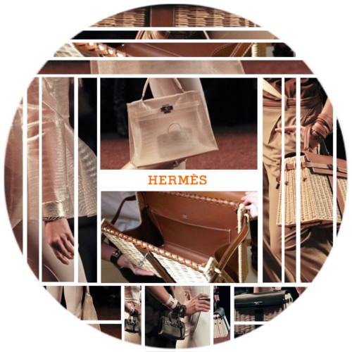
Below - This is the opening page of a recent editorial within French Vogue. I have chosen to show this as I feel the style of text is effective for the editorial. The streamlined and modern font matches the content to follow and the simple use of black and white could influence the aesthetic that we choose to have ourselves for our editorial pages. I feel simple black and white text could work well with our photographs as they have a mixture of strong and soft lighting and a variety of clothing styles with the only factor staying the same throughout is the model that has been used.

Another similar aesthetic is the editorial shown below from US Vogue for Spring/Summer 2011. The use of the simple, casual, minimalist text is the idea that we are most likely to go for our images I think. We all want a simple and chic layout for our images and I think the miminalist look is the way that we will be venturing!
1st page of the editorial
2nd page (title page) I like the idea of having the second page of the editorial as the title page as this is a little unusual and therefore interesting!

3rd page
4th page
Below - This is a shoot that Sophie has found and feels relates to our imagery and could inspire our layout in some way...
The images are not able to be copied into the blog, so this is the link: http://houseofscissors.blogspot.com/2011/04/daisylowe.html
Even though this image is a Spring/Summer 2011 Giuseppe Zanotti shoes advert, I like how the 'rule of thirds' has been succesfully applied to create an interesting alternative to the usual full bleed advertisement. This varient offers a large image as well as room for the company logo and credits making the page and company look like they deserve to keep white space to show themselves off. I like the idea of using a similar layout for some of our editorial pages as I think it will break up the routine of the layout a bit if we alternate with slight varieties of image placement.
This Hermes advert uses an interesting method of displaying close up images of details of their luxury products. The linear structure and repeated pattern symbolises the patterns of the maxi dress from outfit 1 and the abstract facets of a child's imagination mixed with the linear structure and constrainment of the 9-5 job and a normal adult life balancing work, family, pleasure, etc. An alternative layout to show fabric, patterns or textural close-up shots ...
Below - This is the opening page of a recent editorial within French Vogue. I have chosen to show this as I feel the style of text is effective for the editorial. The streamlined and modern font matches the content to follow and the simple use of black and white could influence the aesthetic that we choose to have ourselves for our editorial pages. I feel simple black and white text could work well with our photographs as they have a mixture of strong and soft lighting and a variety of clothing styles with the only factor staying the same throughout is the model that has been used.
Another similar aesthetic is the editorial shown below from US Vogue for Spring/Summer 2011. The use of the simple, casual, minimalist text is the idea that we are most likely to go for our images I think. We all want a simple and chic layout for our images and I think the miminalist look is the way that we will be venturing!
1st page of the editorial
2nd page (title page) I like the idea of having the second page of the editorial as the title page as this is a little unusual and therefore interesting!
3rd page
4th page
Below - This is a shoot that Sophie has found and feels relates to our imagery and could inspire our layout in some way...
The images are not able to be copied into the blog, so this is the link: http://houseofscissors.blogspot.com/2011/04/daisylowe.html
No comments:
Post a Comment